Web Design Trends 2026 - #1 The Rise of Anti-Design
Breaking rules. On purpose.
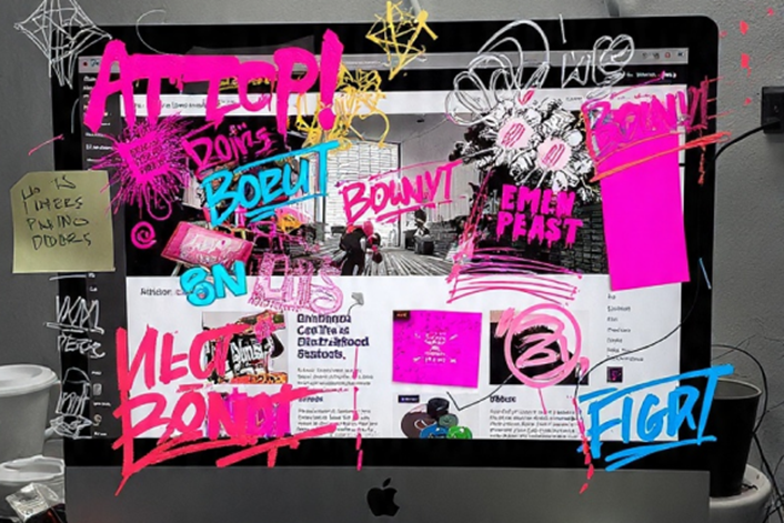
A growing number of designers are deliberately stepping away from polished grids, predictable layouts, and pixel-perfect harmony. This movement, known as anti-design, doesn’t aim to please everyone — it aims to say something. Loudly.
Anti-design rejects the idea that good design must be clean, neutral, or invisible. Instead, it embraces friction, contrast, and surprise. Think asymmetry that feels slightly off-balance, colours that almost clash, oversized elements that dominate the screen, and layouts that refuse to follow the expected reading path. The result is not chaos for chaos’ sake, but a raw, expressive aesthetic that feels human, opinionated, and unmistakably intentional.
From print rebellion to digital playground
Anti-design didn’t start on the web. Its roots are firmly planted in poster design, zines, album covers, and experimental print work where designers had long been bending typography, breaking grids, and challenging legibility to provoke emotion or attention.
What’s new is its migration to digital.
Until recently, translating that kind of visual rebellion to the web required heavy custom code, advanced animation skills, and a tolerance for technical headaches. Today, no-code and low-code tools have changed the rules entirely. Complex interactions, layered animations, oversized typography, and unconventional layouts are now accessible to far more designers. This has unlocked a new wave of experimentation — one where static visuals can move, interfaces can feel tactile, and images can be so large they’re impossible to ignore.
Core characteristics of anti-design
While anti-design thrives on breaking conventions, it often shares a recognizable DNA:
- Asymmetry that surprises: layouts that feel dynamic rather than balanced, pulling the eye in unexpected directions.
- Clashing or high-contrast colours: combinations that create tension instead of harmony.
- Dominant elements: oversized type, massive images, or bold shapes that take control of the screen.
- Unpredictable compositions: navigation, content blocks, or interactions that defy standard patterns.
Used well, these choices create memorable experiences that stand out in a sea of sameness.
Why anti-design is rising now
Anti-design is not a random aesthetic swing — it’s a response.
- Visual fatigue: After years of ultra-clean, minimal interfaces, many users can predict a website before it loads. Anti-design disrupts that autopilot.
- Brand differentiation: In crowded markets, looking "correct" is no longer enough. Brands want to feel distinct, even polarizing.
- Tool democratization: No-code platforms and modern browsers allow designers to experiment without sacrificing feasibility.
- Cultural shift: Audiences, especially younger ones, are more receptive to boldness, imperfection, and expressive digital identities.
When anti-design works (and when it doesn’t)
Anti-design is powerful — but it is not forgiving.
It works when:
- A strong concept leads the design decisions.
- The brand voice is confident and can carry bold choices.
- Users expect experimentation, such as in creative portfolios, cultural projects, campaigns, or product launches.
- The message is simple, allowing visual complexity without cognitive overload.
It fails when:
- Clarity is sacrificed and users don’t know where to look or what to do.
- Accessibility is ignored, making content unreadable or unusable.
- Every rule is broken at once, resulting in visual noise instead of impact.
- There is no hierarchy, leaving users lost in the chaos.
Real-world examples of smart anti-design use
- Landing pages for campaigns: A bold, experimental hero section paired with a clear call to action can drive attention without hurting conversions.
- Creative studios and portfolios: Anti-design reinforces originality and positions the designer as a thinker, not just a technician.
- Cultural and artistic projects: Museums, festivals, or music-related sites often benefit from expressive, unconventional layouts.
In contrast, highly transactional environments — banking, healthcare portals, complex dashboards — rarely benefit from full anti-design approaches.
Experiment — with intent
The most successful anti-design projects are not reckless. They are controlled experiments.
- Break one rule at a time.
- Anchor visual chaos to a clear goal.
- Let content lead the disruption, not the other way around.
- Test bold layouts on low-risk pages before scaling them.
- Always maintain a readable path, even if it’s unconventional.
Anti-design is not about rejecting usability. It’s about questioning default aesthetics and deciding, consciously, when rules no longer serve the message.
The takeaway
Anti-design is not the end of structure — it’s a reminder that structure is a choice. In 2026, the most compelling digital experiences may not be the cleanest ones, but the most intentional. When used with purpose, anti-design doesn’t just break rules. It rewrites them.
Check out examples on Dribble - https://dribbble.com/tags/antidesign